CASE · 2026CASE · 2026
Predicting severe COVID-19 around admission from a CT scan, the chart, and a blood test
Models that combine chest CT, admission records and lab results, using patient data collected from 27 December 2019 to 31 March 2020, to flag which patients were likely to need intensive care, a ventilator, or not survive.
In early 2020, the COVID-19 pandemic was putting heavy pressure on hospital resources, including intensive care beds and mechanical ventilators. In this study, most of the patients admitted with COVID-19 went home without any of these events, but 6.5% were admitted to an intensive care unit (ICU), and some of those went on to receive a mechanical ventilator. Knowing around admission who was likely to need such care would let a hospital watch those patients closely and plan beds ahead.
This post is about a study that tried to make that call from information that is already available around admission. The study was led by Qinmei Xu and Xianghao Zhan, with clinical teams at hospitals across China. My part was designing and validating the models and analyzing the data.
The question
When you go to a doctor, they do not look only at a scan. They ask how old you are, what symptoms you have, whether you have other conditions, and they order blood tests. Each of these tells them something different. The question here is whether a model can also use all of that, and whether it gets better when it does.
For COVID-19 this was a fair test. Chest CT was widely used to assess COVID-19 patients in China at the time, and it shows the pneumonia directly: where the damaged lung tissue is and how much of it there is. But the lungs are only part of the picture. Age, shortness of breath, and blood markers of inflammation say something about how the whole body is coping.
The patients
The study screened 3,522 hospitalized patients with confirmed COVID-19 from 39 hospitals in China, admitted between 27 December 2019 and 31 March 2020. After keeping only patients who had a CT scan within three days of admission and a clear record of what happened to them, and excluding patients under 18, patients transferred or still hospitalized without an adverse outcome, patients without follow-up, and unsuitable CT scans (for example thick slices or motion artifacts), 2,362 remained.
We separated development from testing by hospital, not at random. 1,662 patients from 17 hospitals were used to build the models (inside that group, a random 70/30 split, stratified by death outcome, was used to tune the models and choose among them). The other 700 came from separate hospitals that the models never saw during development. This matters because hospitals differ in scanners, patients and habits, and a model that only works where it was built is not much use.
We predicted three outcomes, each as its own yes-or-no question: admission to the intensive care unit (ICU), starting mechanical ventilation, and death in hospital, each within 28 days of follow-up. These events were rare. Of the 2,362 patients, 2,207 (93.5%) went home without any of them. In the 700 external patients, 59 went to the ICU, 39 needed a ventilator, and 28 died, and these groups overlap (everyone who was ventilated or died had also been in the ICU).
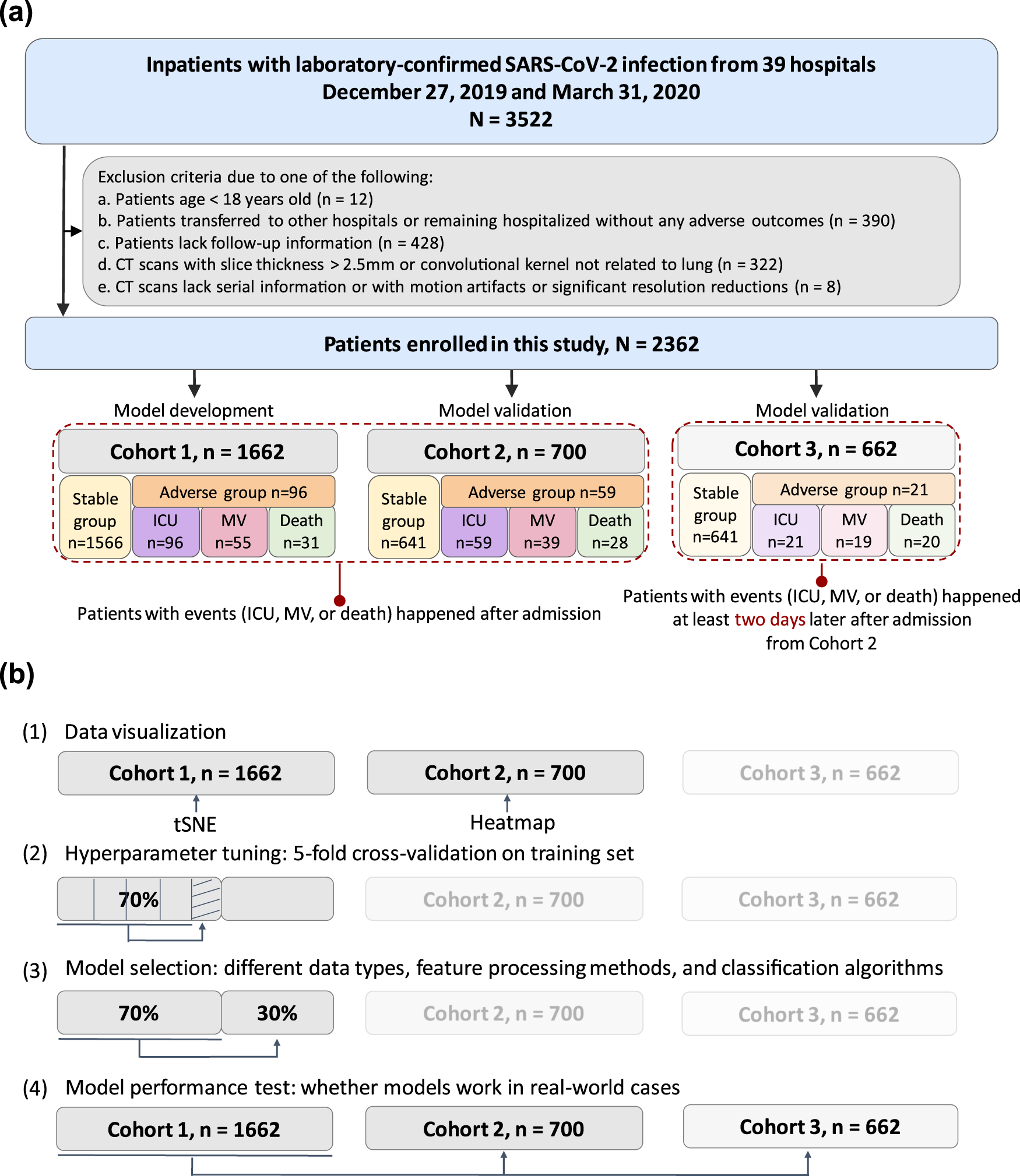 How the cohorts were built and used: development on one set of hospitals, testing on patients from external hospitals. Figure 1, Xu et al., npj Digital Medicine 2021, CC BY 4.0.
Turning a CT scan into numbers
A CT (computed tomography) scan is a series of cross-sectional images of the body, and our models needed a list of numbers. Getting there took three steps.
First, a trained neural-network system found and outlined the pneumonia in each scan: the hazy and dense patches that COVID-19 leaves in the lung. Ten radiologists reviewed all of the automatic outlines. To measure agreement, two radiologists independently outlined the pneumonia on 100 sampled scans, and their overlap with the automatic outlines was close (average Dice overlap 0.95, where 1.0 would be identical).
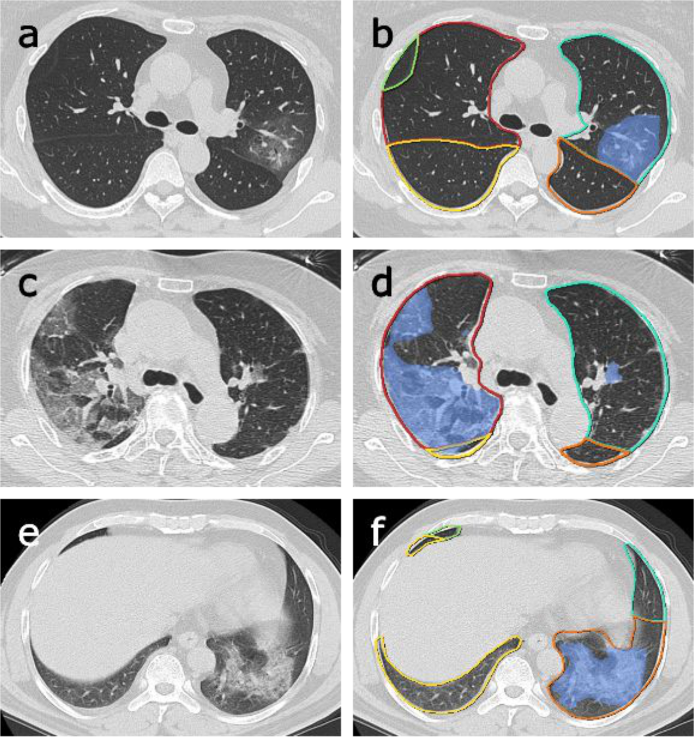 Original CT slices (left) and the automatic segmentation (right): lung lobes outlined in color, pneumonia shaded blue. Figure 5, Xu et al., npj Digital Medicine 2021, CC BY 4.0.
Second, for every outlined lesion we computed 1,657 measurements with an open-source tool called PyRadiomics. This approach is called radiomics: describing a region of an image with many numbers about its size, shape, brightness and texture, for example how patchy or uniform the inside of a lesion looks.
Third, since one patient can have many lesions, we summarized each measurement across that patient’s lesions in six ways (the average, the middle value, the standard deviation as a measure of variation, the skewness as a measure of asymmetry, and the values below which 25% and 75% of that patient’s lesion values fall) and added the lesion count. That gave 9,943 CT numbers per patient.
Next to these sat two smaller groups of information. Clinical information, 18 variables from admission: age, sex, other illnesses like hypertension or diabetes, and symptoms like fever or shortness of breath. And laboratory results, 19 variables from blood tests taken within a day of admission, such as white blood cell counts and markers of inflammation. All of it went in as numbers, joined side by side into one row per patient. This is not a model that reads images and text together; it compares what happens when different sources of numbers share one row.
Comparing combinations
The main experiment was a comparison. For each outcome we trained separate models on different sets of inputs:
- CT radiomics alone
- CT plus clinical information
- CT plus clinical information plus lab results (the full combination)
- clinical information plus lab results, with no CT at all
- a score built from radiologists’ own descriptions of the scan, as a reference for what experts read from the image by eye
For each of the first four sets we tried several standard machine-learning methods, tuned them on the development hospitals, picked the best, and only then tested it on the external patients. The radiologists’ score was different: it was a single logistic-regression model built from their descriptions, used as a reference.
The main score is AUROC: pick one patient who had the event and one who did not, and it is the chance the model ranks the first as higher risk. A coin flip gives 0.5 and perfect ranking gives 1.0.
What we found
In the 700 external patients, the full combination ranked patients best for all three outcomes. On the curves in the paper’s Figure 3, measured on the 700 external patients, the AUROC values were:
| Inputs | ICU | Ventilation | Death |
|---|---|---|---|
| CT radiomics alone | 0.875 | 0.799 | 0.687 |
| CT + clinical | 0.919 | 0.881 | 0.802 |
| CT + clinical + lab | 0.944 | 0.942 | 0.860 |
| Clinical + lab, no CT | 0.911 | 0.816 | 0.769 |
| Radiologists’ score | 0.823 | 0.829 | 0.694 |
The paper also reports results from 30 bootstrap resampling iterations on the external patients. Resampling reuses the same patients; it does not provide new independent cohorts. In those results the full combination scored 0.916 for ICU, 0.919 for ventilation and 0.853 for death. The numbers are a little lower, and the full combination still comes first on AUROC for all three outcomes.
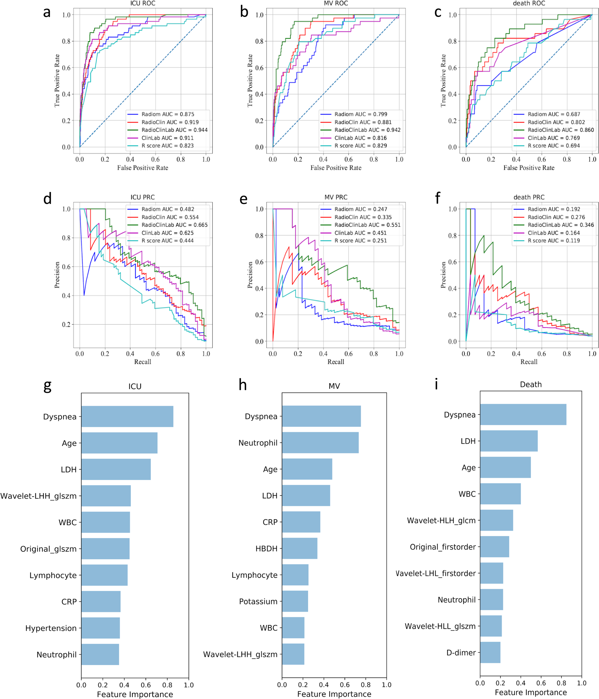 Top row: ROC curves for ICU, ventilation and death in the external patients; the green curve is the full combination. Middle row: precision-recall curves. ROC curves compare the share of true cases the model detects with its false-alarm rate; precision-recall curves compare the fraction of flagged patients who have the event with the fraction of all events detected. Bottom row: the ten most important inputs for each outcome. Figure 3, Xu et al., npj Digital Medicine 2021, CC BY 4.0.
Three things stood out.
The sources helped each other. CT alone did reasonably for ICU admission but poorly for death. Clinical and lab data alone did better than CT on death, but fell well short of the combination on ventilation (0.816 against 0.942). Together they did better than either. When we looked at which inputs mattered most (bottom row of the figure), the top ten for each outcome mixed both kinds: shortness of breath, age, and a blood test called LDH (lactate dehydrogenase, a blood chemistry measurement whose higher values were linked to severe outcomes) near the top every time, with CT texture measurements alongside them. Among these top-ranked inputs, the clinical and CT ones were not significantly correlated with each other, which the paper reads as a complementary role. One reading is that CT describes what is happening in the lungs; the chart and blood tests describe how the rest of the patient is doing.
The CT numbers helped most for ICU admission. Models built on radiomics ranked ICU admission better than the score built from radiologists’ descriptions of the same scans, 0.869 against 0.776 on the resampled estimate. For ventilation and death the advantage was not consistent (for death, 0.667 against 0.678). That is not a claim that software reads scans better than radiologists. The study compared 17 CT features written down by radiologists with 9,943 computed radiomics features, and it did not establish why their performance differed.
It still worked for later events. A prediction is more useful if it comes before the crisis. We also tested on the 662 external patients who had no event in their first two days, so every event in this group happened more than two days after admission. The paper does not establish a two-day gap between each prediction and the event. The full combination scored 0.919, 0.943 and 0.856 there. This group is part of the 700, not a separate set of patients.
Where it falls short
These are results from looking back at records, not from using the model in a hospital. We did not show that using it would change what doctors did or how patients fared.
All the patients came from hospitals in China during the first wave. Treatments, populations and scanners elsewhere differ, and the paper itself says validation in European and American hospitals was still needed. Even inside China, the external hospitals had a somewhat different mix of patients from the development hospitals.
The events were rare, which makes every estimate less certain. With 28 deaths among 700 patients, a handful of cases can move the score. Because the events are rare, the paper reports a second measure, AUPRC, the area under the precision-recall curve. It summarizes the tradeoff between precision (the fraction of flagged patients who have the event) and recall (the fraction of actual events the model detects) across thresholds, and it is read against how common the event is, not as a lower version of AUROC (the death value of 0.248 in the resampled estimate sits against a 4% base rate). On this measure the full combination did not always come first. For death, CT plus clinical information without lab results scored 0.281. For ICU admission among the later-event patients, clinical and lab data without CT scored 0.446 against 0.348 for the full combination. So the honest statement is that the full combination had the highest AUROC across these three tasks in the 700 external patients, including the resampled estimate, not that it won on every measure or in every comparison. In the paper’s supplementary single-run results for ICU admission among the later-event patients, clinical and lab data alone scored an AUROC of 0.958 against 0.948 for the full combination.
Finally, the important inputs are hints about what goes along with getting worse, not proof of what causes it.
What I took from it
Useful information can be spread across different kinds of data. In this study the scan, the chart and the blood tests each saw a different side of the same patient, and putting them together gave the best ranking. That is a reason to combine sources, and also a reason to measure what each one adds, because the gain depends on the outcome and the measure you care about.
This is the first of three questions I keep coming back to in my research: what information we use, what we learn from it, and how we know it will help. The work here needed outcome labels for every patient. The next post, Teaching a model to redraw lung tumors, then reusing what it learned, asks how to learn useful image features before we have labels for every outcome. The third, Eight chest X-ray models, nine datasets, and what one score leaves out, asks how to tell whether a model that scores well on held-out data will still hold up in a new hospital.
The paper is open access: Xu, Zhan et al., “AI-based analysis of CT images for rapid triage of COVID-19 patients”, npj Digital Medicine 4, 75 (2021), https://doi.org/10.1038/s41746-021-00446-z. The code is at https://github.com/terryli710/COVID_19_Rapid_Triage_Risk_Predictor.
I presented these three projects together in my OpenRefinery talk, “AI for Biomedicine”. You can watch it here: https://www.youtube.com/watch?v=Kz_LV64xKjE.